Colour psychology is the scientific effect each hue has on the human brain. Each colour makes you feel differently, so, the wise use of colours in spaces is important. Although the effect of the colours may seem similar, every individual reacts to colours differently. Hence, they are a very personal choice while building one’s spaces.
Colour schemes are the basis of every space and can easily make or break it. The colour of walls, furniture, furnishings, and light plays a role in the essence of the person using the space. It’s a deeply personal choice, as some people prefer certain colours because of how they make them feel, while others might not emit the same energy.
Here are a few colours and the energy they emit:

Red
Red is considered a really powerful hue that emotes in all its eternity. It represents love, power, and passion. You can use it in any space, depending on the intensity of the colour you want to bring out. Whether it’s colour drenching the room to ignite emotions of love or using it in the living room following the something-red theory to show power, this is a hue that never fails to bring out excitement. Red also invites feelings of anger and revenge, in which case it should be thoughtfully paired with a neutral and used only as a highlighter shade and not the primary colour in the space.
Black
Black is stark, but it is a colour that signifies elegance and simplicity. Psychologically, an all-black space can be overwhelming and gloomy, but when it is paired with a contrasting colour, it enhances the overall aesthetic drastically. Contrary to popular belief, black is an excellent addition to the design world through which simplicity is accommodated in the design trends.
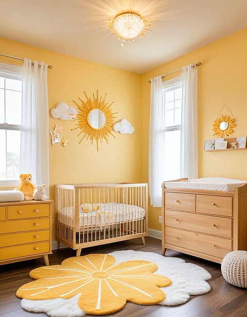
Yellow
The colour yellow is synonymous with sunshine, hence evoking the feeling of light, happiness, and energy. This hue is mainly used to add life to the spaces and productivity. Though most of the shades of this colour have a positive effect, a few lighter hues can bring about dullness and the feeling of sickness in the space.
Green
Green is generally associated with nature because of which instantly reduces stress and hypertension. This hue can be used in many ways — through walls, soft furnishings, and even through plants. Green is a powerful colour in interior design, and it has versatile features. Lighter shades can be used on walls and darker shades for the accents, which can also be neutralised to avoid overpowering visually.
Neutrals
Neutrals like whites, ivory, and beige often bring calm and peace to any space. They can form the entire colour scheme for a space or can be used to balance out the colours chosen. They give a spa-like, relaxing energy to spaces and are great mood stabilisers. Any completely neutral space will have fewer raised emotions. These can be paired with any colour to make spaces vibrant and can be used as a premium primary tone when paired with metallic tones.
Design is an art marrying preferences with the versatility of finishes to make spaces personal and significant. Understanding colour psychology to make better choices for emotional benefits is better than following trends without understanding the overall impact they can have. The choice of colours should be based on what brings one joy and peace, so spending long hours in these spaces doesn’t get overwhelming and hazardous to one’s everyday life.