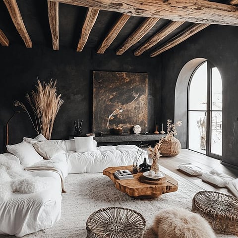

The past year saw people craving for communities, connections and calm. With digital noise taking over, not everyone enjoyed the chaos and maximalism it caused. As every year, Pantone has decided a colour of the year Cloud Dancer — which impacts the design industry. It’s a soft, airy white chosen because the world is exhausted. The trend highlights timeless elegance through white walls that feel expansive, modern, and fluently serene.
Binding spaces together
With open layouts being adapted to, a neutral element to bind the spaces is essential, not just for clean aesthetics but also for the energy the space gives out. Multiple colours on a wide view of the same space can easily turn into visual clutter. Cloud Dancer can be seamlessly used to bring multiple niche spaces together, making it look cohesive and intentional.
Anchor bolder tints
The use of bolder colours often overwhelms, adding character to spaces if it’s not done strategically. A neutral white will provide the required balance to anchor the space, restricting visual overthrow of the darker colours used.
Combine other neutrals
White is the base of all neutrals, and along with being the perfect balance for deeper hues, its characteristics also help highlight other neutral finishes in any space. From wood to marble, white helps celebrate luxe details even when they are in different shades of white. Metal accents also take centre stage when paired with neutral whites.
Accentuates textures
A neutral-like-white, most times, complements textures and lets it be celebrated in all its glory rather than competing with it. Using Cloud Dancer on walls and ceilings or cabinetry alongside stone or live edge wood would definitely leave a lasting impact in any space.
Supports bold patterns
When spaces are designed around a neutral shade, an accent is often needed to add character to the space. Whether it is paint, wallpaper, or even printed upholstery, the neutral takes a back seat to make the accent stand out. White is often the chosen neutral to bring out the best in patterns that are bold, to help overcome the otherwise clinical visual.
Brightens light-deprived rooms
Natural light is one of the most underrated aesthetic updates spaces need. In many spaces, this isn’t possible if there are structural restrictions or it’s a rented space. In these scenarios, using an airy, soft shade for the walls becomes significant. White has and will always remain a dark room’s best friend.
Balances a moody palette
Dark emeralds, deep burgundy, and navy blues are some shades that, when paired with white, create contrast instead of overpowering. However, if spaces are dressed only in dark, moody colours, they become gloomy and lack life, which cloud dancer can perfectly balance. These colour pairs work really well, even for furniture and décor.
Cloud Dancer is not just meant for painting walls. The type of paint chosen makes a lot of difference, too. Matte finishes feel soft, while satin finishes slightly reflect light. It is important to keep in mind the colour, texture and finish while designing spaces. Layering multiple shades of white with natural finished and earthy colours will be something the design industry will see in abundance this year. Let’s eliminate creative burnout with calming, curated spaces this year.