What if your chair could tell a story? About the memory it holds and the changes that it predicts to happen. Cinema’s best production designers know that every interior element is a silent narrator. Last year, they built rooms that don’t just house characters but also the story. Vinesh Banglan, the production designer behind Lokah: Chapter 1, understands the balance between beauty and purpose. Working with an urban city’s neon-soaked nights and reflective surfaces, he faced a tempting trap to the huge spectacle’s overwhelming story. “When the light falls on the frame, it gives a beautiful look to the film,” he says. “But instead of going for the beauty of the film, we should focus on the story narration and the performance. The glow we get from it should be there in the background.” That discipline runs through every film in this collection. These interiors switch between performance and holding space. From south India’s grounded domesticity to Gothic restraint, here are spaces created on-screen from 2025 that we can take inspiration from.

Odum Kuthira Chadum Kuthira
The house borrows from Kerala’s modern residential vocabulary with brick-and-plaster textures, open sit-outs that offer a porous relationship between inside and outside. Muted earth tones, soft yellows and greens, and diffused lighting adorn the interiors. Furniture is functional — wooden dining tables, cane seating, low beds, and open shelves that prioritise use over display. The patches of mirrors placed behind the dining area in one of the introduction scenes multiply space, and can be a lesson to add depth. The bougainvillea arch outside and the whole house lit in warm lights add a subtle festive look.
Retro
The beginning of Retro appears to be set within a large, traditional South Indian ancestral house resembling Chettinad vocabulary with long axial layouts, internal courtyards, thick masonry walls, timber columns, and a strong sense of symmetry. Chettinad houses have always been a favourite in Tamil cinema. Once in Ceylon, we see the house’s structure relies on dark-stained wood, lime-plastered or stone-finished walls, and terracotta or oxide flooring. Light enters through doors filtered by thin fabric curtains and seashell hangings, which break harsh daylight into softer patterns. Furniture is sparse but includes high-backed wooden chairs, sturdy tables, storage cabinets, and open shelves.
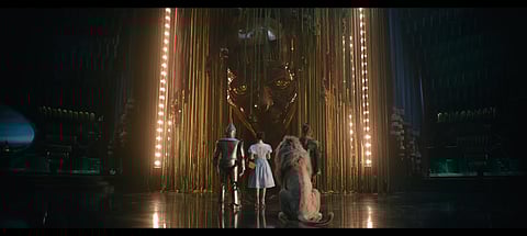
Wicked: For Good
The interior world of Wicked is a duet between Glinda’s pink and Elphaba’s green. Glinda’s domain is a lesson in ethereal softness. It is supported by pastels — light blue, silver, grey, and expressed through sheer fabrics, polished surfaces, and diffused light. Elphaba’s green is often paired with the severe contrast of black or elevated with metallic gold. The materials here are textured and organic — rough stone, aged wood, hanging vines. The integration of natural, organic elements is equally inspiring, as seen in Munchkinland’s innovative use of nine million tulips as living roofs, reminding us that incorporating regional materials and nature-inspired textures can ground a space while adding whimsical character.
Lokah: Chapter 1
Chandra’s home follows a cellular plan. Rooms are clearly defined. Thresholds matter, including doors, curtains, glass partitions. Movement is linear, suggesting a life lived inward, control over boundaries, safety over spectacle. Heavy wooden cupboards, upholstered armchairs with rounded arms and low furniture grounded to the floor function as inheritance pieces, not lifestyle buys. Lighting is low, localised, and warm. The bachelors’ apartment is spatially porous. The living, dining, and kitchen blur into one another. Mismatched chairs, an overcrowded table, temporary seating, and performative lights — disco dots, blue-green spill, mixed colour temperatures. This space is for being busy and partying.
Frankenstein
Architecturally, the film relies heavily on verticality and weight. Gothic arches, oversized statuary and towering shelves create a constant sense of being watched and judged. The bedroom scene uses a red satin bedsheet paired with fragile lace-trimmed pillows. The cool blue wallpaper behind this warmth creates chromatic conflict that mirrors the characters’ fractured inner worlds. Materials are dense including stone, dark wood, metal, absorbing sound and light, making rooms feel heavy.
Bad Girl
In the protagonist’s native home, the bedroom functions as communal territory rather than retreat — a compressed, sun-flooded room where boundaries between self and family dissolve. The college dorm operates through institutional symmetry: two single beds banished to opposite walls, identical wooden frames supporting thin mattresses, surfaces that deny individuality. Personalisation arrives through stacked posters on the wall. Her own apartment marks a decisive spatial shift. Walls are painted deliberate pink. The bed sits low, dressed in simple linens under softer, controlled light. The kitchen, though compact, asserts itself through organisation. When surfaces are allowed to rest, when objects are chosen rather than accumulated, even modest interiors achieve expansiveness.
Dies Irae
In Dies Irae, architecture practices withhold from excess decoration. Spaces are composed to hold. Large uninterrupted planes allow light unobstructed passage, while the curved staircase with glass balustrades transforms movement into a transparent narrative. Material restraint governs every surface. Muted upholstery, tonal grey bedding, layered curtains filtering daylight through sheer white, then heavier drapes. Furniture maintains a low profile with rounded edges echoing the curved architecture. White walls employ subtle textured panels, trusting light and shadow as decoration. Artificial lighting remains warm and localised, never flooding. Tall foliage at hard edges introduces organic verticality without decorative excess.