
To be modern means being able to read signages and maps in public spaces and navigate your way to your destination independently. However, you might have encountered situations at metro stations or airports where, despite the abundance of signs, a person approaches you for help in traversing the ever-changing urban landscape.
It’s an age-old remark: Oh! How much this place has changed! The urban environment is evolving rapidly, call it capitalism, a love for urban development projects, or the demands of urbanisation. New ventures each year transform the cities we inhabit. Consider all the flyovers, new buildings, recreational parks, and, of course, shopping malls.
How, then, does we make sense of our surroundings when new elements are regularly reimaginng it at a large scale?
This is where design steps in — bridging the gap between memory and the new. Our cities are filled with various kinds of signages and wayfinding objects — directional signs on roads, highways, inside malls, hotels, heritage sites, and other places of significance. TMS sat down with Lopez Design, a design studio based in Gurugram, to understand the process behind creating these communicative objects — signages — for the Central Vista, inaugurated last year.
Constituting concept
“It took us around two years to develop a system of wayfinding tools and signages, and you could say the work is ongoing. We are still auditing and looking for ways to improve the user experience. We have an improved batch of signage s ready, which will be used when it’s time to replace the current ones,” says Anshul Kapoor, vertical lead at Lopez Design. Their studio not only handled the wayfinding for the main axis of Central Vista, the Kartavya Path, but also for the Parliament building, the Prime Minister’s estate, and other upcoming structures along the axis.
Designing a visual graphic language for the central axis of the country is no small task. “When we got this opportunity, we felt slightly burdened by the responsibility of creating something impactful and representative of our nation’s ethos,” shares Anthony Lopez. The concept devised by the studio was accepted by the government and their team, and that is what we see today at the Kartavya Path.
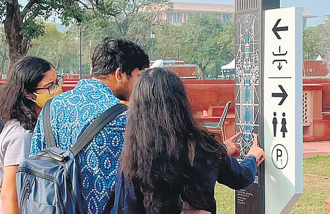
The signage system for Kartavya Path features a monolithic signpost inspired by two iconic elements from India’s past — the Iron Pillar of Delhi and Ashoka’s Dharma Chakra. “The design incorporates contemporary lines, reflecting where we are today as a country. While it draws from symbolic figures, it also embodies a contemporary aesthetic,” remarks Kapoor. Kartavya Path, meaning the Path of Duty, aligns with the chosen symbol of Ashoka’s Dharma Chakra, with its 24 spokes representing cosmic law and order. and the Iron Pillar, a 7.2-meter post from Chandragupta II’s reign, symbolises Indian mastery in metallurgy that has endured through the ages.
These signposts, with their blend of historical symbols and contemporary design, serve both a symbolic and practical purpose in the heart of India’s capital, guiding visitors while honouring the nation’s rich heritage.
Design details for a utilitarian object
Although designing a wayfinding system is primarily about ensuring efficiency and functionality, a complex set of customisations went into this project to make it stand out, align with requirements, and appeal to the senses.
One such decision was developing a custom font set for the entire Central Vista. “After extensive discussions, we adopted the November font set, which has variable thickness controlled by a slider. Our team in Gurugram collaborated with the font design studio in the Netherlands to create what is now known as Ashoka TPT. This font can be used for government projects beyond Central Vista,” says Kapoor. Lopez adds, “Roman and Devanagari scripts were meticulously matched in weight, with customisations made to the bindu in Devanagari for a distinctive look.”
Every element of the signage system was tailored to enhance design and user experience. Through user flow mapping and thorough audits, “strategic positions were identified for around 130 to 150 signages on Kartavya Path,” says Kapoor. Small directional posts are placed at key intersections, each with a map to help users orient themselves through custom directional engraving based on whether they are going towards the India Gate or the Rashtrapati Bhavan.
Orientation maps at major junctions offer an aerial view of the Vista, guiding visitors to official destinations, tourist sites, amenities, and transit options. Additionally, regulatory signs and taller pedestrian directional signages ensure clear navigation along the wide path.
The use of a planar view of the Central Vista on the wayfinding boards is unique and aligns well with modern sensibilities of reading Google Maps to navigate. In fact, a full view of the site gives a sense of relief to tourists who might be visiting for the first time. “As a traveller, you can feel anxious and need to know where you are.
These signages act as markers. They don’t shout at you but are visible when you look for them,” says Lopez. While one might wonder why not just ask someone for directions, in places of mass assembly like this, where thousands of people are present and everything looks similar, wayfinding systems are crucial for self-navigation.
Evoking inclusivity
The signage system design at Central Vista is leapfrogging global standards. It has managed to include Braille signages at every junction and designed a gender-neutral toilet symbol that does justice to people across the gender spectrum. “Braille signages and tactile maps are integrated into each sign and consistently placed at the same height for easy access from a wheelchair.
We worked closely with the Central Public Works Department (CPWD), tactile pathway designers, architects and other stakeholders to create a system that feels seamless and intuitive,” says Kapoor. Lopez remarks, “There is no appropriate icon for gender-neutral amenities globally; the half-man, half-woman symbol currently in use is an insult to the people.” Their team of sensitive designers developed a new gender-neutral icon after a series of intense debates which also won the German Design Award in 2023.
Their work at Central Vista opens up new possibilities for design and the transformative impact it can have in the modern world. It calls for more design-based professionals to be involved in public projects, envisioning a future India that could be design-first. In a world where urban environments often feel disjointed and alienating, a thoughtfully- designed space, object, graphic element, or system can bridge the gap between our sensory and cognitive experiences, making our interactions with the city more intuitive, inclusive, meaningful and less confusing.