
How much surprise is too much surprise? Sitting in an unnamed bungalow on Barakhamba Road, getting ready for an unveiling, its white façade at the entrance did let attendees pick on the hints of what Péro’s opening show at the just concluded Lakmé Fashion Week X FDCI was about.
A wonderland of memories that revives the adorable Japanese cartoon character Hello Kitty in our memory. Who doesn’t remember the merchandise many of us flexed as kids — from pencils and erasers, lunch boxes, water bottles, hair bands to funky handbags that we carried on our picnics?
The venue and its themed décor, painted that childhood right in front of us—on a massive embroidered wall mural inspired by ’90s pixel art, we were welcomed with images of ditsy florals, Hello Kitty’s face, her bow, telephone, and heart-sealed letters, hooking us viewers. A photo booth adorned with hundreds of stuffed Hello Kitty toys became a joy-land evoking the child inside us.
All across the venue, on trees hung stuffed toys of cherries, strawberries, apples, creamy cupcakes — the everyday favourites of Hello Kitty, and they looked like visual treats sewn by the Péro team. A Hello Kitty van, washed in pink, invited guests over for snackable treats while a big heart shaped gingham check pattern stuffed installation provided a picture perfect frame, reminding one of Péro’s signature patterns.
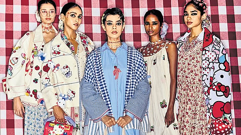
Soon, on cue from a live band playing nursery rhymes, models walked out in shirts, dresses, jackets, and trousers in the Hello Kitty hallmark colours of pinks, reds, blues and sunshine yellows. The everyday essentials featured Japanese flora and solid nautical stripes. Further, the pieces were elevated with surface ornamentation including fabric origami, hand crochet, appliqué, tessellation, patchwork, and custom-shaped wooden buttons.
While these elements were an insignia of the label’s signature cottage core aesthetic, it came with a twist! The label blended it with the Japanese Harajuku street style, which plays heavily on layering, eccentric colours, quirky accessories and prints featuring popular characters. TMS catches up with Arora on the “joyful union” of Péro with the Japanese lifestyle brand Sanrio which created Hello Kitty in 1974. She throws light on conceptualising a new design sensibility called “Cottage Core Kawaii” and celebrating collective childhood nostalgia.
How did this collaboration with Sanrio for Hello Kitty come into being?
I am a strong believer that the universe brings people together, and that is the force behind making things happen. During the Covid-19 pandemic, I watched a documentary called The Toys That Made Us, and came across an episode on Hello Kitty, and I got to learn a lot about the humble icon, her journey, and her philosophies. She stands for strong bonds. Her purpose is to spread love and joy. She doesn’t have a mouth, which means believing in actions and letting work speak. It resonated deeply with me. Also, there was a line by Sanrio that goes like this “small gift, big smile”— that stayed with me. In early 2024, when Hello Kitty was celebrating its 50th anniversary, and they were looking for someone from the fashion world in India to collaborate with, it’s very fortunate that they chose us.
How long did it take to put this collection together?
Any season at Péro takes two years to shape up and that includes an intensive research process. We started working on the Spring/Summer ’25 collection two years ago, but then Hello Kitty came to us with this collaboration opportunity, eight months ago. While this was exciting for us, it did bring forth the challenge to mix our already ongoing works of S/S ’25 with the new theme. But it worked out seamlessly.
Within such a short time, how did you materialise the collection given Hello Kitty has its distinct colour palette and ensembles had to match that?
Initially, we centred our designs around signature checks and sailor stripes, with a core colour palette of soft white and blue — initially devoid of red. However, with the introduction of Hello Kitty, red began to emerge, adding a vibrant contrast. Fortunately, the colours that we had chosen for the season, like blue, white, and pink, were already the colours of Hello Kitty. It took a beautiful shape towards the end.
Tell us the Indian crafts that were at play this time.
The collection features woven stripes in mashru and gingham checks from West Bengal, along with Chanderi stripes and checks from Madhya Pradesh. For embroidery, we’ve embraced traditional techniques like French knots and satin stitch, infusing the playful essence of Hello Kitty into our designs.
How did you achieve the quirk element brought in by Hello Kitty?
Hello Kitty’s whimsical world is filled with cupcakes, cherries, strawberries, and apples. It inspired us to incorporate mixed media and three-dimensional embroideries. We explored the playful use of bows — origami, embroidered, and knotted — drawing a connection between Hello Kitty and Péro through the heart motif.
Our crochet pieces feature red and blue stripes and checks, creatively interpreting patterns from the Hello Kitty universe. Elements like doughnuts, cupcakes, and fruits are transformed into delightful charms, adorning clothing and accessories in imaginative ways. These elements not only embellish our designs but also draw inspiration from the Jibbitz trend, allowing for personalisation.