Malayalam computing enthusiasts were upbeat when Nirmala, a new font, was announced with the Windows 8 OS. Users of the language expected it to be better than its predecessor Karthika, which many felt was unaesthetic.
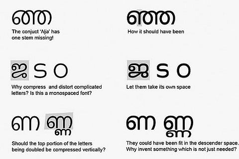
But unfortunately, what they got was a ‘distorted font’, which according to a designer, did not even “abide by the basic typographic rules”. One conjuct even has a missing stem. Some words written using the font therefore appear compressed and distorted. Nirmala is the default Malayalam font in the Operating System as Times New Roman for English.
If any document using the font gets printed, it can be misleading, especially for those who are not too much acquainted with the language. “Besides, if it gets into books or any other such valuable documents, people would just absorb it even without realising the grave mistake,” said P M Hashim, Font designer, Design Difference.
He said that some of the Malayalam words were not shown as it is originally written. “Besides, many words have confusing stroke ending style. Also it has sub standard design quality. This sort of error happens when fonts are designed without consulting the experts,” he alleged.
“It happened when Karthika font was designed. It was unaesthetic and had unacceptable shapes. I have even pointed out the mistakes earlier too. But repeating similar mistakes shows that the matter was of least concern to them,” Hashim said.
“We have an online forum (http://typophile.com/) where we take up such issues. When I pointed it out, they were not even ready to acknowledge. They dismissed it saying that the missing stem was due to a bug which has already been fixed. They also ensured that they are also working with language experts to resolve additional issues with the fonts .
