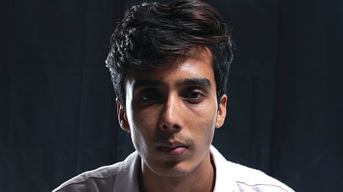
The four boys of Padakkalam have been all over social media ever since the film’s release. But for Arun Ajikumar, who played Nakul in the movie, this isn’t his first ‘blockbuster’. The 25-year-old from Edappally is already an accomplished designer and the founder of the design collective Aesthetic Kunjamma — a prominent name in the movie poster design domain, not just in the Malayalam film industry, but across south Indian cinema. A Bollywood project too is coming up soon.
Although Arun has a strong theatre background and considers acting his first love, the pandemic led him into the uncharted territory of design. And he’s made quite an impression — his portfolio now includes titles like ‘Bramayugam’, ‘Aavesham’, ‘Hit’, ‘Kaantha’, ‘Bougainvillea’ and more. In a breezy chat with TNIE, Arun shares his journey, vision, and ambitions as an artist. Excerpts:
How did Aesthetic Kunjamma come into being?
I’ve been into arts since childhood — my foundation was theatre. I started acting in Class 3 and did short films and even a movie, but ended up studying B.Com, which I wasn’t interested in. I was in my second year when the pandemic hit. It was a frustrating period creatively, with no way to pursue film roles. So I started an Instagram page in 2020 to stay engaged and began posting a bunch of vintage photos of Lalettan (Mohanlal and Mammookka (Mammootty) with quirky captions. I also started reimagining current films in retro style and vice versa, which people loved. That’s how Aesthetic Kunjamma grew.
How was your theatre experience?
Theatre played a huge role in shaping who I am today. My father enrolled me to help me break out of my shell. I got to meet many kids and fascinating artists at a very young age. It also gave me the chance to travel and gain exposure. We even performed at the National School of Drama in Class 5 or 6, though back then it just felt like a fun trip. I took it seriously only by Class 7.
The name of your venture is quite catchy. How did you come up with that?
I liked the quirky contrast of it. I started hearing the word ‘aesthetic’ in college. There’s a sense of sophistication to that word, right? We’d associate it with flowers and butterflies. On the other hand, names like ‘Valyamma’ (elder aunt) or ‘Kunjamma’ (younger aunt) have this slightly uncool image. I thought combining the two would be fun. Initially, my content was all about mixing desi films with global references — like a poster featuring Kamal Haasan sir’s Nallasivam from ‘Anbe Sivam’ and Tom Hanks’s Forrest Gump sitting on a bench together. That kind of mashup came naturally from the quirky name. I believed desi culture had a global market, but naming the page wasn’t strategic. I’m also a huge fan of Philomina ma’am. The logo is a tribute to her.

It’s important to have a team that understands the nuances of your ideas. How did you pick yours?
We’re an eight-member team at Aesthetic Kunjamma. My co-founder, Deepak, is a design expert. I met him online during the lockdown after I had started Kunjamma. We began exchanging ideas, and as we explored different aspects of design, the team naturally started growing. Interestingly, none of us met in person for over a year — everything happened online. None in my current team has a design background, and I believe that makes us unique.
How did you get into movie poster designing?
As the page gained popularity, projects started coming our way. We began with short films. In Malayalam, our first official project was Shane Nigam’s ‘Veyil’. We were also approached by Mani Ratnam sir’s Madras Talkies to design a segment called ‘Coffee, Anyone?’ for a web series. Our entry into the film industry was unplanned. As someone who wanted to get into the industry, I sensed this was my way in.
You have an eye for detail, and it shows in your work. What’s your creative process like?
When I watch a film, I don’t just see the surface — I tend to dive into five or six layers of it. I imagine the process behind each scene. Among my works, my favourite is the ‘Mayaanadhi-Shape of Water’ mix. When I first watched 'Mayaanadhi', I was blown away by the idea and details in it. Later, when I watched ‘Shape of Water’, I noticed a connection. In the climax, Tovino’s character gets shot by the river and just before dying, he sees his lover. I started imagining, “As he sinks into the river, what if he slips into a lucid dream where he reunites with her and comes back to life?” It felt very 'Shape of Water'-like to me. Thoughts like these are what end up in a poster.
I think my eye for detail also comes from my theatre background. Theatre taught me to see how a single line or a costume change can have multiple layers of meaning. My mentor there once told me there are only seven or nine stories in the world and all stories stem from these core ideas. What makes an artwork come alive is how you build on those ideas and bring them to life.
Posters have become almost a film’s identity now, reflecting its creative depth. How do you view the evolution of film posters?
Posters have always been used in branding a film, but over time, especially in the age of the internet, they have evolved into more of a storytelling medium. Earlier, posters were straightforward announcements, often pasted on buses or walls. Their main job was to let people know that a film, starring so-and-so, was coming soon.
While working on ‘Sarvam Maya’, Akhil chettan (Akhil Sathyan) told me how Sathyan Anthikad sir used to say that the most important thing with posters back then was that even someone on a moving bus should be able to read the film’s name. The hero’s name came second. During the period between ‘70s and ‘90s, the focus was on clean, flashy designs that caught your attention quickly. Later, posters began to feature the hero’s face more prominently. Even Alfred Hitchcock’s posters sometimes included photos of himself and the producer. Putting the star’s face helped build trust with the audience and spark interest.
With the internet era, posters shifted from being just informative to becoming creative communication. Design elements like color palettes, patterns, and symbolism began to matter more. Posters started to engage people on a deeper level — they made you think, and feel and even gave you that little dopamine hit. But I still believe it’s important not to overdo printed posters.
You often include Easter eggs in your posters. How do you come up with those?
It starts with understanding the film deeply. Whenever we take on a project, I prefer reading the full script instead of just a synopsis—that helps us layer the poster with subtle details. Our audience, especially post-Covid, has become advanced with exposure to international content. So, for them to spend five minutes on a poster, it has to be engaging. I feel a good poster is one that would invoke thoughts in me.
You also use different mediums for designing like embroidery for 'Madhuram’ poster and oil painting for 'Dies Irae'. How do you decide on that?
Deepak and I love handmade things. We feel it has a timeless quality that digital works lack. We throw random ideas while working on a project. For Madhuram, which is set in a hospital, we thought about using a hospital bed sheet for the title. We considered painting or digitally printing it but finally decided on embroidery. For ‘Coffee, Anyone?’, we used a coffee and water mix. It is human to be imperfect, so we try to incorporate that raw, relatable quality into our works.
What was the brief you got for ‘Dies Irae’?
I cannot divulge anything at the moment (laughs). I have been associated with the project for the past one year now, right from pre-production work. I know the whole thing, so I didn’t need a brief from Rahul ettan (Rahul Sadasivan).
There is buzz that there is Pranav Mohanlal’s figure in the title poster released on his birthday...
You will understand that when you watch the film (laughs). The poster has all the elements of the film.
Many are also spotting Illuminati elements...
There’s nothing Illuminati about it (laughs)! We intentionally included certain elements that are connected to the film, that’s all. It’s fun when people start interpreting things on their own.
You’ve been collaborating with Rahul Sadasivan since Bhoothakaalam...
Rahul ettan is like an elder brother to me. We share a great bond beyond just work. I was introduced to him during 'Bhoothakaalam' through Shane Nigam, who was my senior in school. He’s a true visionary. The ideas he comes up with are incredible, and honestly, he’s just getting started. I genuinely hope I get to work with him on at least the next 10 projects!
Mammootty has been a strong presence in your career. How was your experience working with him?
I first met Mammookka on the sets of 'Kannur Squad'. For 'Bramayugam', our initial idea was a poster of Mammookka sitting upright with his walking stick, in an angry expression.
That was the director’s vision, and Mammookka gave us exactly that. We took a few extra shots and were about to wrap up, but then he said, “Let’s take a few more,” and started experimenting with his expressions.
That’s when the magic happened—we got that iconic sinister smile that defined the poster. For Dominic and The Ladies Purse, I initially did something generic. Mammookka wasn’t happy with that, and he called me personally and asked me to try something new. That was how the notice-like poster was born. He supported all my experiments. It was a privilege to brand his movies.
How was the design process for 'Aavesham'? How does that stand out from the rest of your work?
We knew 'Aavesham' was a unique project with its scale and quirkiness. When Anwar ikka (Anwar Rasheed) entrusted us with 'Aavesham', we were thrilled. We were also keen on exploring such a fun coming-of-age, over-the-top entertainer, and my team had already designed posters with a celebratory element.
However, we realised the film’s scale was different once we saw the stills. We had to reflect on the central character and the equally important supporting cast in the posters. It was a challenge because we joined the project only a month before release and couldn’t do a photoshoot. We still managed a fun campaign by brainstorming together to create 10-15 posters.
What about 'Lokah Chapter One: Chandra'?
It’s an exciting project. Nimish chettan (Nimish Ravi) has been my mentor from the very beginning, so we’re genuinely happy for him. The film has a lot of elements that will definitely excite the audience.
You have ventured into other languages as well...
Yes, we have done posters in Tamil, Telugu and Kannada. Our Hindi project, 'Go Noni Go' starring Dimple Kapadia, is coming up. In Telugu, we have Rashmika Mandanna’s 'Mysa' lined up.
Could you say something about your work on Vignesh Shivan’s 'Love Insurance Kompany (LIK)'? The posters look futuristic...
It’s a fun rom-com set in the future, and working on it was a great experience. We created our own props, like an autorickshaw from 2070 and a tea stall from that time. We even reimagined the Chennai Metro. It gave us a lot of room to experiment visually. There have been films set in the future before, but this one has Vignesh sir’s unique touch. It’ll be an interesting watch.
Aesthetic Kunjamma designed the flags for different dynasties in 'Ponniyin Selvan'. How did you get on board? Were you concerned about criticism over historical accuracy?
We had already associated with Madras Talkies for 'Coffee, Anyone?'. For Ponniyin Selvan, another agency was handling the work, but the team wasn’t happy. We were approached just two days before the shoot. They gave us a lot of material, but we also did extensive research. The brush strokes, designs and everything were different in those times. Getting them accurate was the real task. We did research for one day and executed it the next day.
Were there any projects where you faced criticism?
Of course. There have been projects we poured our hearts into, but they didn’t land well with the audience. 'Thankam' was one of those. We had high hopes for it, but the design received quite a bit of backlash online, especially on Reddit. But then Syam ettan (Syam Pushkaran) consoled us. Looking back, I think we’ve become much better at handling criticism. We genuinely appreciate constructive feedback.
As AI continues to take over many fields, what are your thoughts as a designer on using AI in creative works?
It is inevitable. I think there’s no problem in using AI to enhance our vision. But if we are completely clueless and heavily dependent on AI, then that’s a problem. It’ll only lead to something generic. Using AI will start becoming common and get cluttered in maybe two years. People will then return to traditional, authentic work. At Aesthetic Kunjamma, we try to minimise the use of AI.
Coming to acting, you are currently basking in the success of 'Padakkalam'...
I have done around seven films now, but it was after 'Padakkalam' that people started recognising me. I am happy that people are appreciating our work.
Did you anticipate such a success? How was your rapport with co-stars?
We were all confident in the content, but we didn’t expect the scale of response it has garnered now. The crew was fun to work with. We shot in Amal Jyothi College and stayed at a guest house within the institution. So it was like college days all over again. I didn’t have many dialogues, so I used to ask the other boys if I could take their lines, and they’d give me. I’d also ask the director if I could contribute my own dialogues, and he was fine with it. We had good chemistry off-screen, which I believe helped the movie as well.
You also designed the title poster for 'Padakkalam'...
Yes! When Manu chettan (Manu Swaraj) mentioned that the title design hadn’t been finalised, I offered to give it a shot. The crew really liked what I came up with, and we eventually ended up doing two or three posters for the film.
What are your upcoming acting projects?
I’m a part of Nivin Pauly’s 'Sarvam Maya', directed by Akhil Sathyan. There is also another project in the making.
What is your vision as an artist?
I want Aesthetic Kunjamma to grow into a vibrant community of artists — a platform where everyone can explore their talents and help shape a new creative culture. As for acting, I aim to be part of exciting projects. I don’t want to limit myself.