Growing up, most of us had a favourite colour and we wanted it on our clothes, toys, and birthday cakes. We may have even tried to get our walls to be that shade – with varying levels of success in convincing our parents to paint a room entirely in hot pink or blood red. This whimsical wish of dipping our rooms in one colour is not just a childish fantasy anymore but an interiors trend called ‘colour drenching’ that homeowners and interior designers are incorporating with elegance. “There have been more requests for this in the last six to eight months than ever before. Most of the time, requests for an entire room in one colour (typically a dark blue or gray) used to come from young boys in their teens or from girls who wanted their rooms in different shades of pink,” says Madhu Sarangi, the co-founder of Ishaan Kone Architects and Interior Designers.
While this technique has been popular in commercial places since the pandemic, using it in residential projects is relatively new, shares Akshita Mehra, the creative director and founder of Studio Goya. “Making a whole room in blues or greens is a tough call because it’s experimental. People are open to it now because they are moving away from the more minimalist, Japandi styles and are open to doing something bold,” she says.
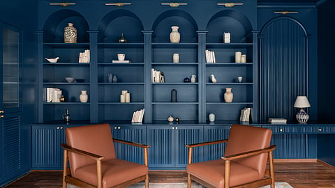
This ‘bold’ look, often shared on social media, inspires clients to experiment, according to interior designers. They also highlight its ability to make spaces look bigger. Vamsidhar Reddy, an IT professional in his thirties, says, “When I was working in Finland and other places in Europe, I used to see a lot of greys and whites in apartments and studios. I grew fond of these colours. With colour drenching, my main aim was to make my apartment’s living room look bigger and also bring a positive energy with bright colours.” Explaining how this works, Sarangi shares, “When there’s a colour contrast, like a white ceiling against darker coloured walls, the room looks smaller. When you use one colour, the idea is that the lines between the walls and ceiling fade away, making it one big cohesive space.”

Colour, colour, which colour?
Committing to one colour can be tough and what you pick depends on personal preferences plus the purpose of the space you want to drench. Poornima Shivaprasad, the principal architect at Studio Aura, suggests picking a colour you truly love and planning carefully. “Always choose a colour that reflects your personality and complements your space. With colour drenching, the colour range is not just restricted to paints – it can be your bedding, home decor, and flooring. Make your mood board very wisely – it is important to see how the chosen colour interacts with the room in daylight and at night.”
While the room can have different shades of the same colour, Sarangi advises that the undertone must be consistent. “There can be lighter or darker shades, but if you pick grey as a colour, there are shades of grey with a beige undertone and with a white undertone. Even if one of the elements you choose has a different undertone, the overall look will not come out the way you expect.” Incorporating complementary colours through home accessories, can help, suggests Shivaprasad. “It’s always ideal to add some contrast – for a room with blues, you could use mustard yellow elements.”
What to drench?
Before you jump on the bandwagon, experts suggest incorporating the trend strategically. Shivaprasad advises not to try colour drenching an open layout home, as it can be challenging to define boundaries. She says, “However, at entrances, in narrow corridors, or stairwells, a single, bold and continuous colour makes the space feel very intentional. In bathrooms, a single colour makes it more luxurious and gives a spa-like feeling.” According to Mehra, “Spaces where people aren’t spending too much time are places you can get experimental, like powder or media rooms.”
Playing with texture
Adding different textures into a space is another way to style up the trend. “You could incorporate different wall textures, wood can be dyed into the right colour using veneer, different fabrics like velvet, suede and cotton can be used,” explains Mehra.
What about adding elements, say metal or wood? Mehra welcomes them. She says, “A lot of people are doing stainless steel interiors and working with metals like brass in commercial spaces. People are also using brick while maintaining the terracotta tone when playing with different materials.”
The Antiquarian Bookworm, a bookshop of rare books in Bengaluru is a case in point. “We went all out with wooden finishes on the floor, ceiling, bookshelves, doors, and walls. We used it to fade the entire surroundings into the background, and bring the books into focus. When someone walks in, they feel surrounded by a sense of being in the past because of a lot of wood being used in colonial designs for luxurious spaces and libraries,” says Sarangi.